
The joy with watercolour is the glorious colours you can create. Pigments interact with each other as weak as the water to create the most marvellous effects ~ well, that is the hoped for outcome. It is easy to end up with a mud~like mess. I have painted with watercolour for a number of years now, but still feel as if there is a huge amount for me to learn. So, I signed up for Helen Burrow’s workshop on colour mixing.
I have been to some of Helen’s workshops before, and love her teaching style. I was not disappointed with this one, largely because she structured the three days so that each exercise used skills from the exercise before. She encouraged us to play ~ it’s only paint and paper. As adults we rarely allow ourselves to experiment. It is so easy to let the end product dominate, forcing ourselves to stick to the tried and true.
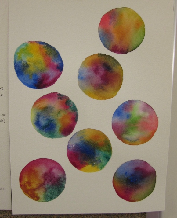
The very first activity was playing. After drawing circles on the paper we dropped in paints of different colours. None of them had to be perfect, they were simply pompoms. It was wonderful to see how they ran into each other and produced new colours. You really loosen up when you are doing seven, eight, nine of them. While the original vibrant colours are stunning, look at the colours that are mixed where they meet. There are some interesting purples and neutrals here.
For the next exercise Helen directed us to draw three “petunias”, to which we added specific colours. The first triad was cobalt blue, aureolin and permanent rose, all transparent and clean. The second triad was alizarin crimson, windsor yellow and phthalo blue, again transparent but rich and jewel-like. The third included opaque colours, cadmium red, cadmium yellow and cerulean blue.

Do you have a favourite combination of colours?
At last, I was developing a deeper understanding of the different colours. It is important to know how the qualities of paints [transparent, warm/cool, staining, their bias etc] to know which ones to use when. For example, transparent colours will create darker hues than opaque ones.
Our last activity for Day #1 was to choose our own triads and experiment. I especially loved the combination of quinacridone gold, viridian and my own purple (cobalt and quinacridone magenta). The mix is in the bottom left corner. BTW the four big blobs in the centre and right are wet on wet, the three down the left side are wet on dry. The last photo is of our show and tell at the end of the day, showing great diversity between artists.


Day #2 and we were raring to go. There was more colour mixing as a warm up. Then Helen asked us to compare Windsor and Newton sepia with Daniel Smith sepia. They are probably the leading watercolour paint brands. She was encouraging us to look at the different brands because colours are not consistent across brands. Sepia is a good example. The W and N is blacker and duller than the DS, which seems to have more warmth and depth to it.
The next challenge was to create our own sepia! With some help from Helen I used burnt sienna and French ultramarine to produce a lovely soft grey.
Then we became a little more botanical, as we traced a photo of a rose and transferred the tracing to watercolour paper. Then, using our sepia mix we did a tonal drawing of the rose. The photo shows the finished tonal drawing, with a spray of yellow as I began the next part of adding a little colour to the painting.


So, by Day #3 we were ready to do a rose painting. It sounds daunting, but as Helen’s previous activities had lead us to this point, we had the confidence!
It was time to put the knowledge from the previous two days to use ~ looking at the photo to see what colours there were, understanding the value of those colours (was my selection enough of a range of values along the grey scale?), thinking about warm and cool colours, complimentary colours. Then to mixing. You can see by the colour chart that I had to work my way through a few mixes. The new gamboge and permanent rose, top right, was the first mix, then I worked my way to quinacridone gold and magenta. It is the quiz gold that gives the painting its glow. There are other mixes too, a cool, soft blue for the cast shadows and the warm quinacridone magenta and sepia mix for other shadows.

A new piece of paper, a new tracing of the rose and I was in heaven, gently moving around each petal to let the paint and water work their magic.

There’s still a way to go, but I know that the colours are working and that I have put down a good foundation. I think I like painting roses!

13 replies on “The glories of watercolour!”
The finished rose illustration is lush and beautiful, but somehow my favourite of the series is the tonal drawing with a couple of colours added. It’s like a plant evolving and coming to life, colour bleeding into something pale and dry.
LikeLike
Thankyou so much for sharing. Love your roses.
LikeLike
Thank you Sandi. I have never thought of my self as a rose painter, but now I am thinking differently. Of course, I am coming to that realisation right at the end of the rose season, with only very late bloomers around!
LikeLike
Oh those roses are beautiful! Oddly enough though, I was most taken by the very first one, the white and purple tone on tone? It’s truly ethereal, like the ghost of a rose.
LikeLike
Many in the class were taken by that one too, although they saw it after I added the colour chart around it. I was too lazy to get a new piece of paper! I love your image of a ghost rose. It may start a series of ghost roses……
Hope you are enjoying this sensational late Autumn weather, even though we do need the rain.
LikeLike
Yes, please! [on the ghost roses] and not so much on the weather. There have actually been a couple of [minor] fire alarms nearby due to the continuing dry. The rain the other day was very welcome but it only wet the top 2 or 3 inches. Below that the soil is still bone dry. 😦
LikeLike
I’m so glad I’ve ‘found you’ out here in cyberspace! I am enjoying your posts and learning so much. Thank you for sharing your learning.
LikeLike
I am glad that we have linked up too. I am only too happy to share my learning, partly because it helps me to consolidate my knowledge.
LikeLike
Wow, that looks like 3 days well spent. I prefer the monochromatic rose too…
LikeLike
The whole time was a delight Sandra. I am privileged to be able to spend the time and money doing something that I love, in the company of like-minded women. I am intrigued that people like the monochromatic rose. Something to play around with!
LikeLike
Thank you so much for this post.
LikeLike
I am pleased that you like it! It helps me consolidate my learning too.
LikeLike
Anne, I loved reading about the process and the application of colors. We often used watercolors as girls and it was a sad day when the colors were gone. I took a brief introduction to watercolors a few years ago, and seeing this brings it all back. You’re work is lovely, today and always.
LikeLike