
I have really appreciated the feedback you give me for my oil pastel trees. You have left me so many positive comments, as well some sales.

Oil pastels as a medium still excites me. In fact tomorrow I am going to a workshop where watercolour and oil pastels as mixed. You can imagine how my eyes lit up when I saw that one advertised!
I still have a lot to learn about colour, but I know that putting some colours side by side will make each one sing. To create with oil pastels I layer marks over other marks, as well as sometimes smudging the marks together. My usual method is to just pick up the colour that seems right; usually this works, but sometimes it doesn’t. I have decided to try more rigour.
So I started my experimenting with a colour wheel.

The triangle in the middle of the wheel shows the hues that make up a split complementary. Those three were my my dark, middle and light tones. What would I get if I limited myself to these six pastel sticks?
First layer were the blue and purple, to create the dark park underneath the canopy. Some smudging to merge the marks.
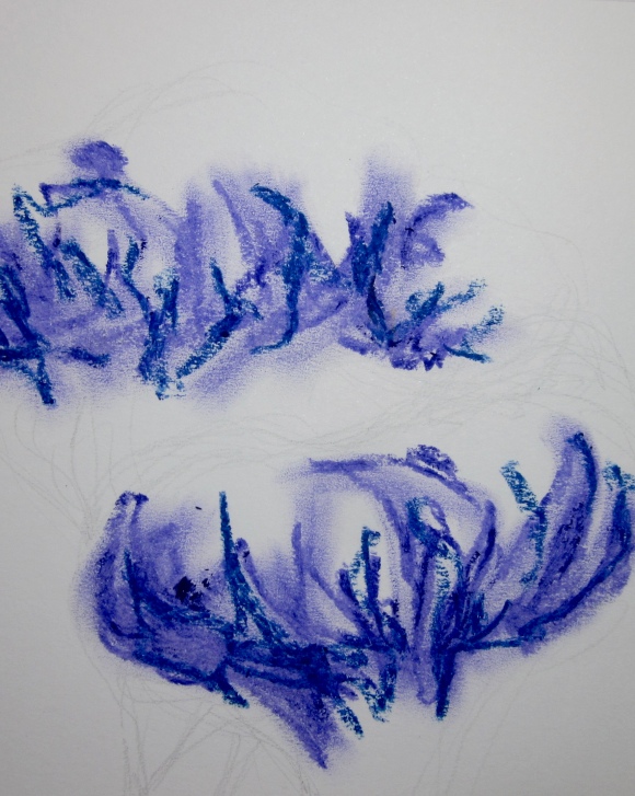
The browns add some vibrancy.

Adding the light pastels creates the magic because they also smudge the other marks. Can you see how the yellow over the blue has created a blue-green? And how it changes the colour of the browns? So the six original colours have mixed to create more, and unexpected ones too.

The next stage is to draw the ink branches and trunk. In black ink or brown? Probably brown, but maybe not…..
And after that I might have a play with another split complementary.

26 replies on “More trees”
Enjoy your class, one I was really looking forward to got cancelled at the last minute, I was devestated. Thanks for sharing how you work and how the colours are built up, it was very interesting.
LikeLike
What a shame that your class was cancelled. Will it be put on again? I am glad you enjoyed how I built up the colours. I am hoping that after tomorrow’s class I will have lots more ideas and techniques.
LikeLike
You’ve achieved some beautiful effects. I’d have such a lot of trouble working with these; I can’t bear it when the pure colours are ‘polluted’ by working over each other, like when you get dark colour on the tip of your yellow felt tip pen as a child! I’m clearly far too anal for my own good, and I’m going to stick to fabric and thread 🙂
LikeLiked by 1 person
No pollution of colours in quilting! I understand what you are saying…..I don’t always don’t want to push the colours because I worry about them becoming muddy. I will talk to Mark about it at the workshop tomorrow. (Glad to see that you have some internet access in Miss Lizzie at the moment. 😀)
LikeLike
Not a lot of internet access; we’re camped at the bottom of a cliff and in a narrow strip of land behind a large sand dune with trees on it. Mostly we can get on line if the Husband puts our mobile internet dongle on the roof of the caravan!
LikeLike
The ingenuity of campers!
LikeLiked by 1 person
Fascinating, Anne
LikeLike
Thanks Derrick. It’s always good to get feedback.
LikeLiked by 1 person
No idea what a ‘split complementary’ is, but I like the image that emerges from the process. 🙂
LikeLike
Ha! Thanks Meeks. I am not really sure about split complementaries either ~ it was what it said on the the colour chart! More research needed.
LikeLike
lmao – sorry! But if you find out, please let me know.
LikeLike
I love posts like these, where we get a peek at your process and watch things come together, with your explanation! I’d love to take a color theory course–I think it would help me a lot with weaving–I tend to be very safe with my color choices.
LikeLike
A colour theory choice would be great. I hadn’t thought about colour selecting in weaving, but of course, it would be a very important part of the art. I love posts about processes too. Understanding how something has come about adds so much more depth, don’t you think?
LikeLike
Color in weaving is really strange and different than other things I had done. The interlacement of threads means that you don’t often get the pure colors you started with. I am having a hard time envisioning what my product will look like.
LikeLike
I can understand how it would be difficult to envisage colour in weaving. I suppose too that the type of weaving will affect how the colours are seen.
LikeLike
After it’s safe arrival, I took my tree to the framer, Natalie, today. We spent ages deciding on a frame and mount – finally settling for an antique white mount and a silver-grey plain frame. Interestingly Natalie remembered framing your feather, as well as the beautiful piece of crochet that Kerry sent me a few years ago.
It’s lovely to see some of the process in creating these beautiful pictures… the skills that you have leave me in awe. I hope your class goes well and look forward to seeing some of the results.
LikeLike
I can’t wait to see how your tree looks in its frame. Antique white sounds like the perfect setting for it. (I sent another tree drawing off to Wales the other day. The country will be populated by my trees!) My class was great, and I learnt so much. There is a blog post coming soon.
LikeLike
How lovely that your trees are colonising Wales… I could happily have a whole forest all to myself.
LikeLiked by 1 person
Love the trees!
LikeLike
Thank you Katie. That means a lot to me.
LikeLike
Loved this post, Anne. I use colors by instinct, too, so it’s interesting to get more info about them. I did a pastel class yesterday and, although I doubt I will switch to pastels entirely, I did learn a lot of good things. But not oil pastel. There’s always more to learn, isn’t there?
LikeLike
I loved the examples of your pastel work that you posted on Instagram. Very expressive! You are so right that there is always more to learn, and I appreciate the generosity of artists who willingly share what they know. Have you come across Jane Blundell? She is a watercolour artist who has an incredible knowledge of paints, pigments and mixing colours. Lots to learn from her.
https://janeblundellart.blogspot.com.au
LikeLiked by 1 person
Of course! I’ve been following her blog for a while. It’s nice also to be able to go back to her old posts. I also like Jessica Seacrest’s reviews (terrible for the wallet, unfortunately :-))
LikeLike
I haven’t heard of Jessica Seacrest. I will look her up.
LikeLike
Anne, your work is like magic to me. I’m just blown away by your use of color and texture in everything you do. My friend was so touched to receive your drawing. I enjoyed holding on to it for a bit and seeing the work close up. Your photos do it justice, but still, holding an original is pretty special. I love my color wheel, and will pull it out from time to time when I’m struggling with complimentary colors. Thanks for sharing.
LikeLike
Thank you for those words, Alys. I love texture, and try to recreate it whenever I can. I doubt that I could work with flat washes of colour. I would have to add things to it. 😉
LikeLike